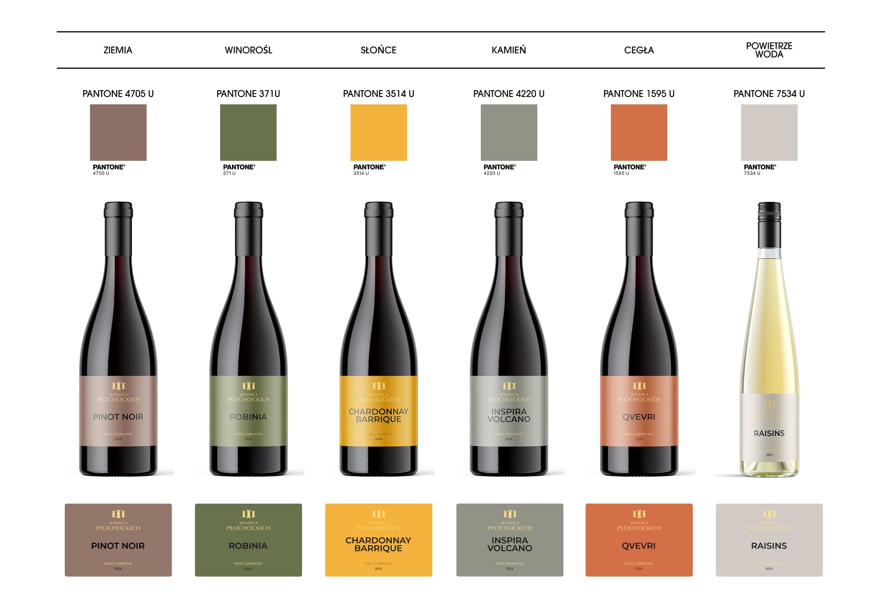
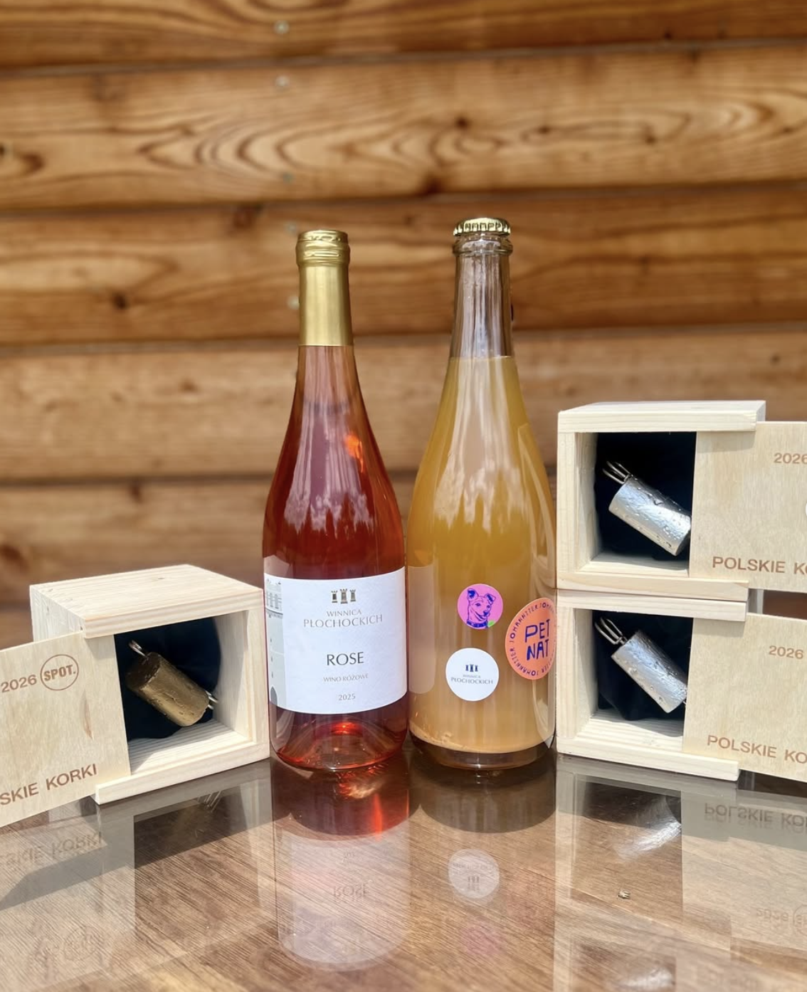
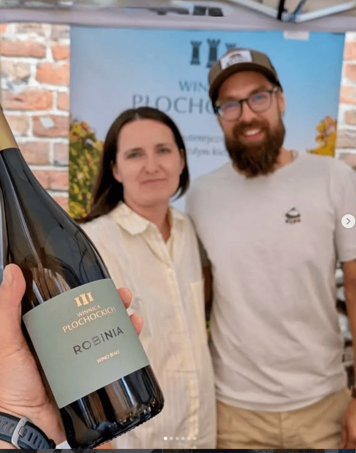
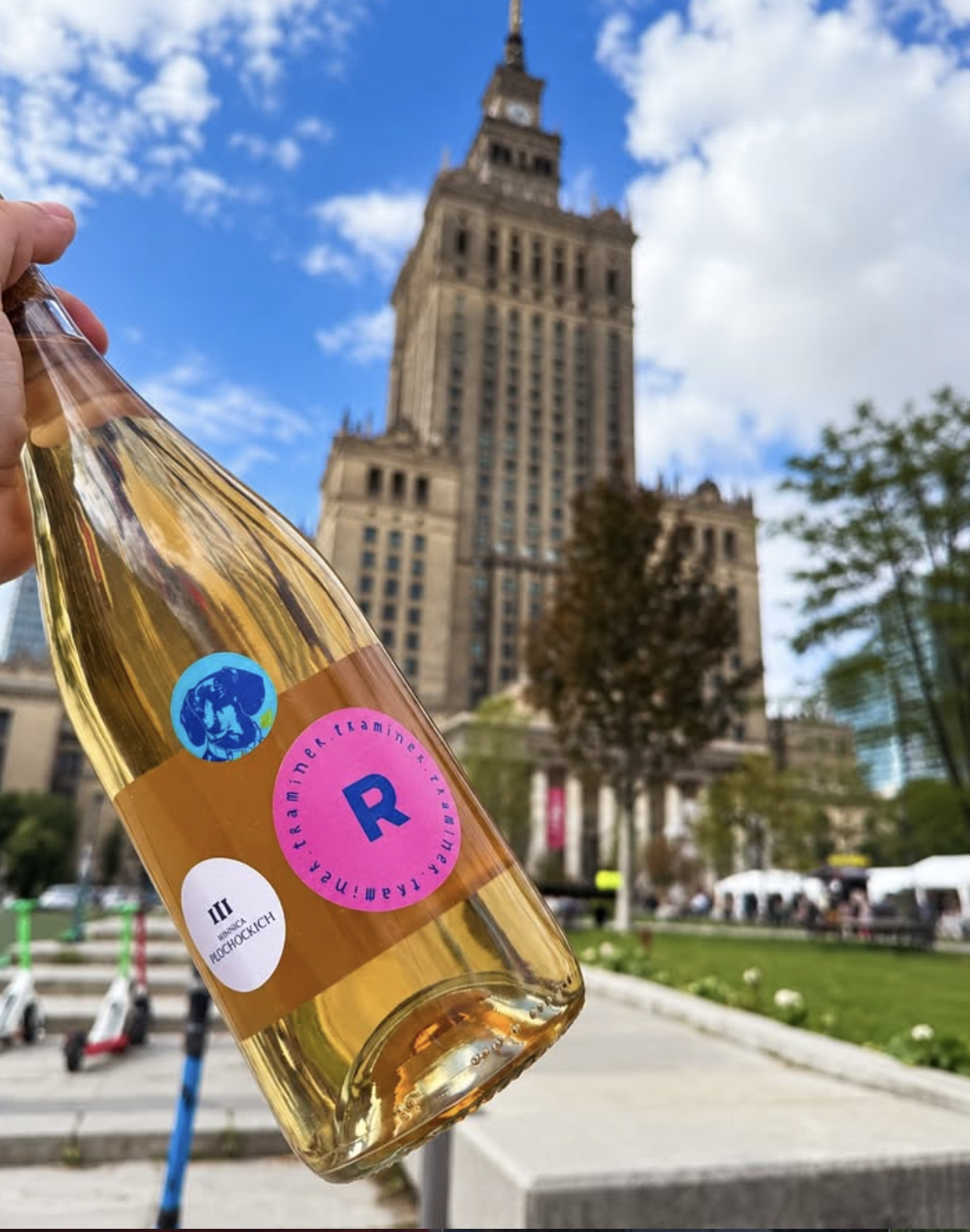
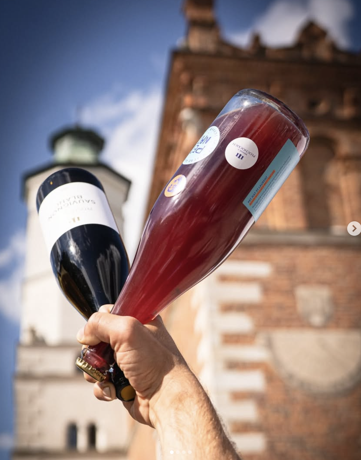
A visual refresh of Winery Płochockich’s wine portfolio, evolving the existing identity into a more contemporary and cohesive range. From refined, minimal labels to bold and playful Pet-Nats, each wine line was given its own personality while remaining part of the same visual family.
The work was recognised with a design award at Polskie Korki 2026.
Former look
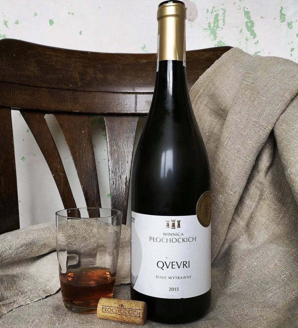
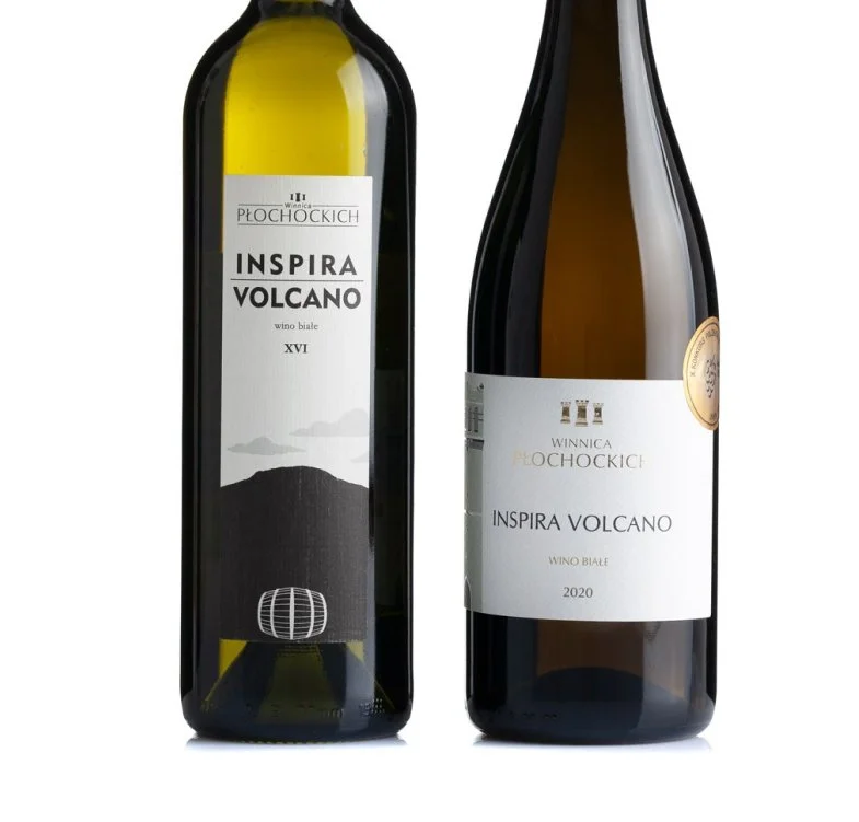
Moodboard / creative research
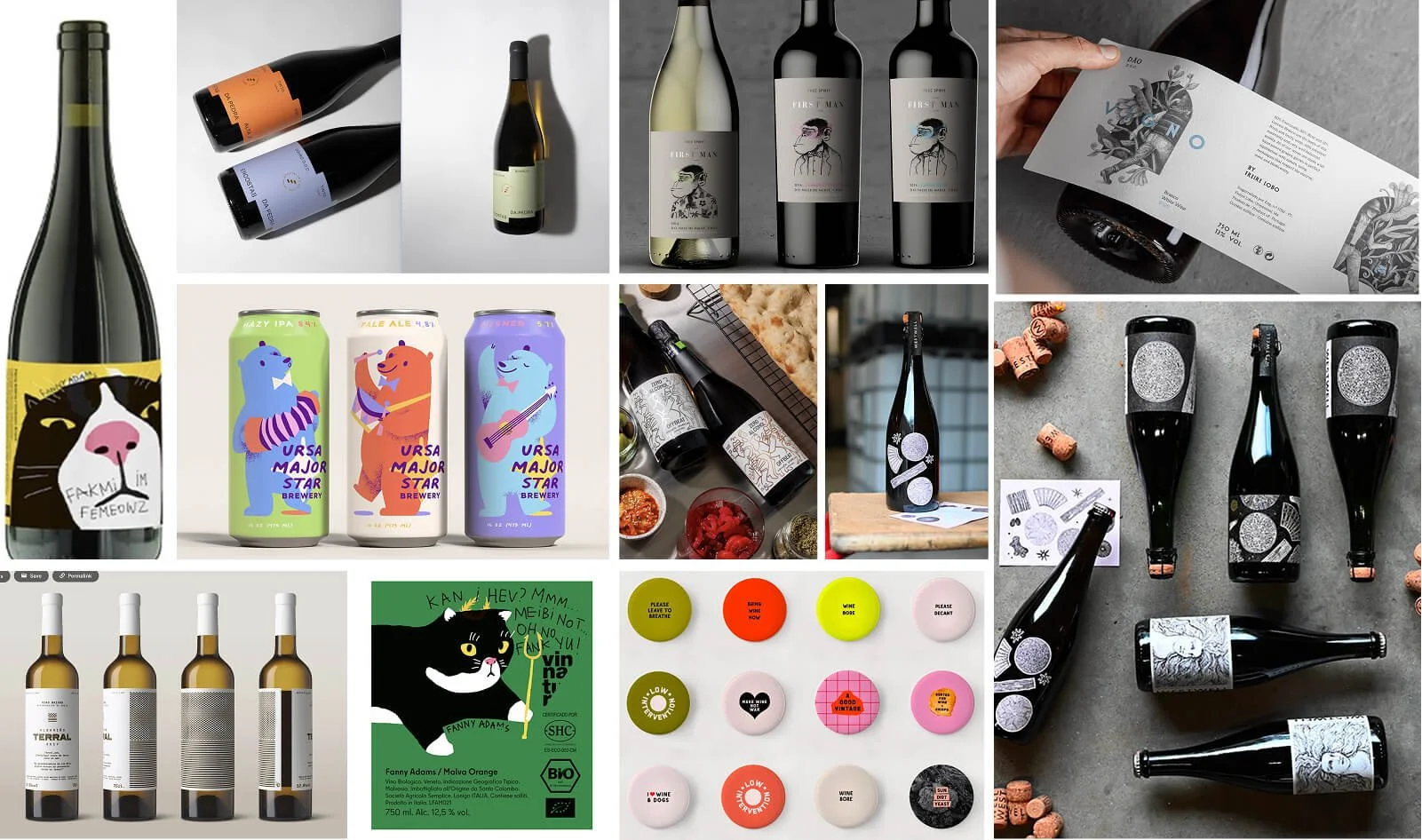
Initial ideas
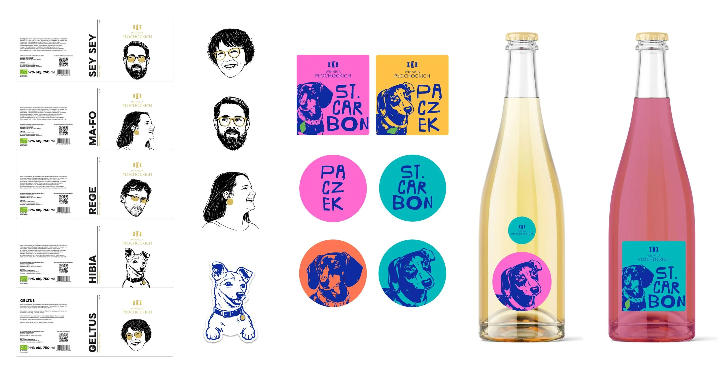
Development - Creating three distinctive wine ranges.
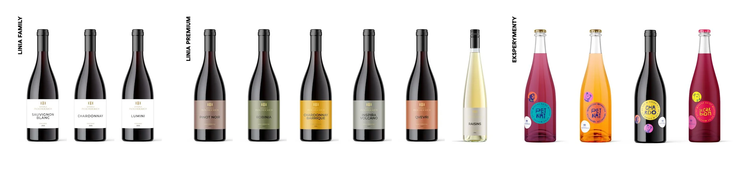
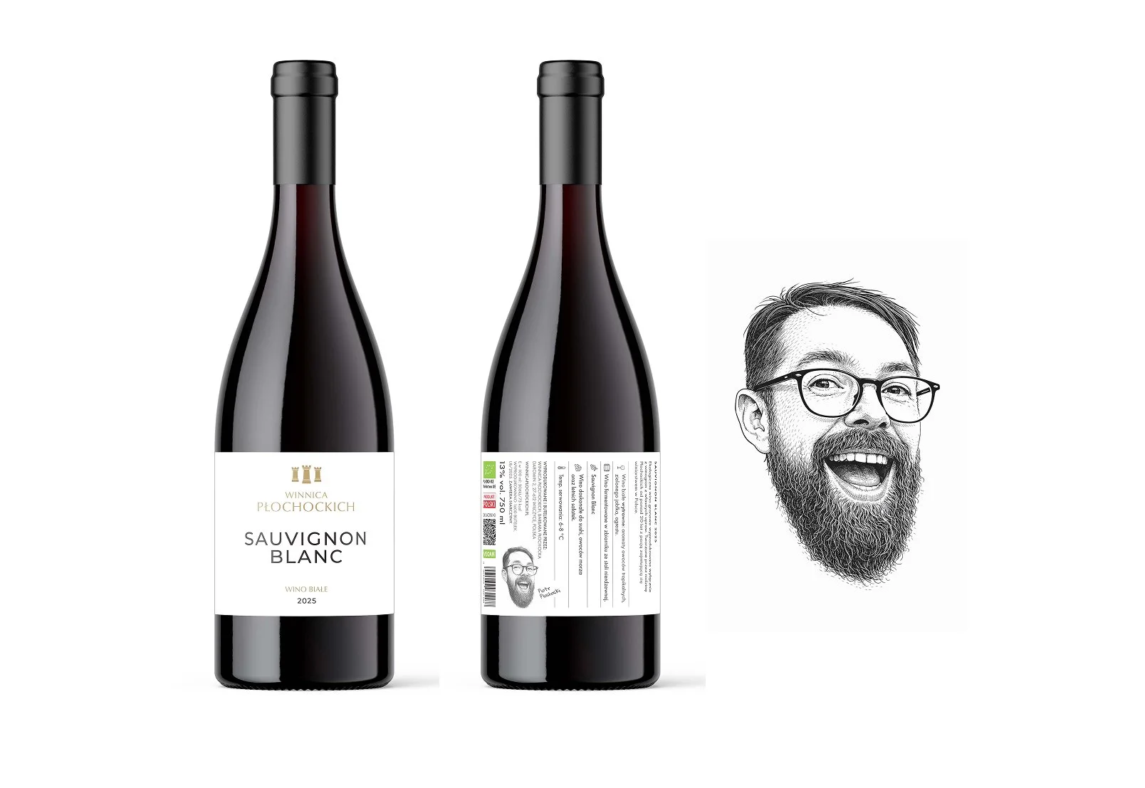
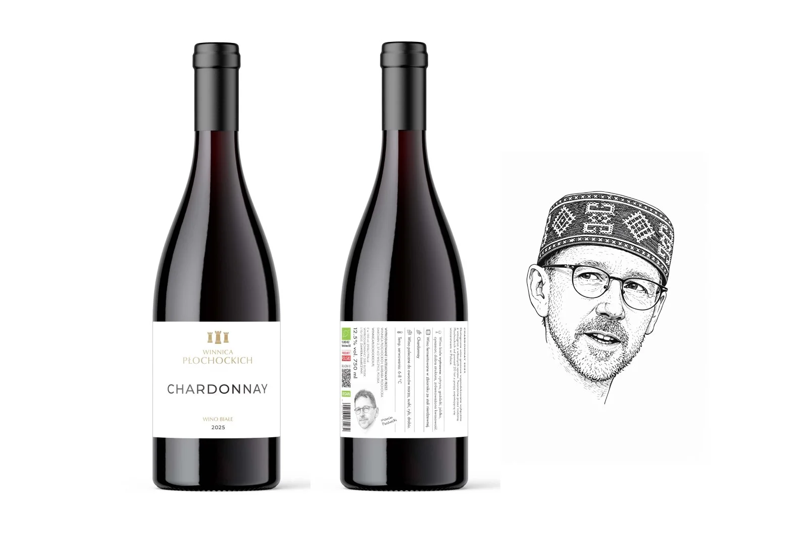
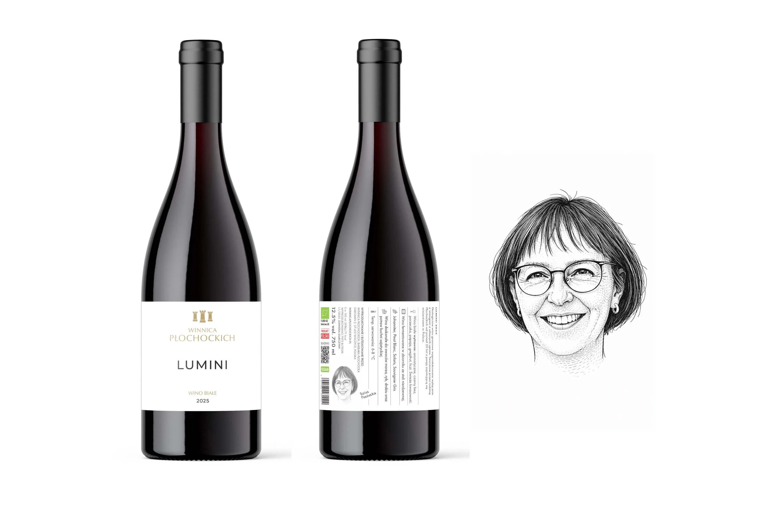
FAMILY LINE. A clean, elegant range that brings the Płochocki family story into the identity through illustrated family portraits (AI-genreated). The minimal labels are elevated with gold hot stamping and raised spot UV

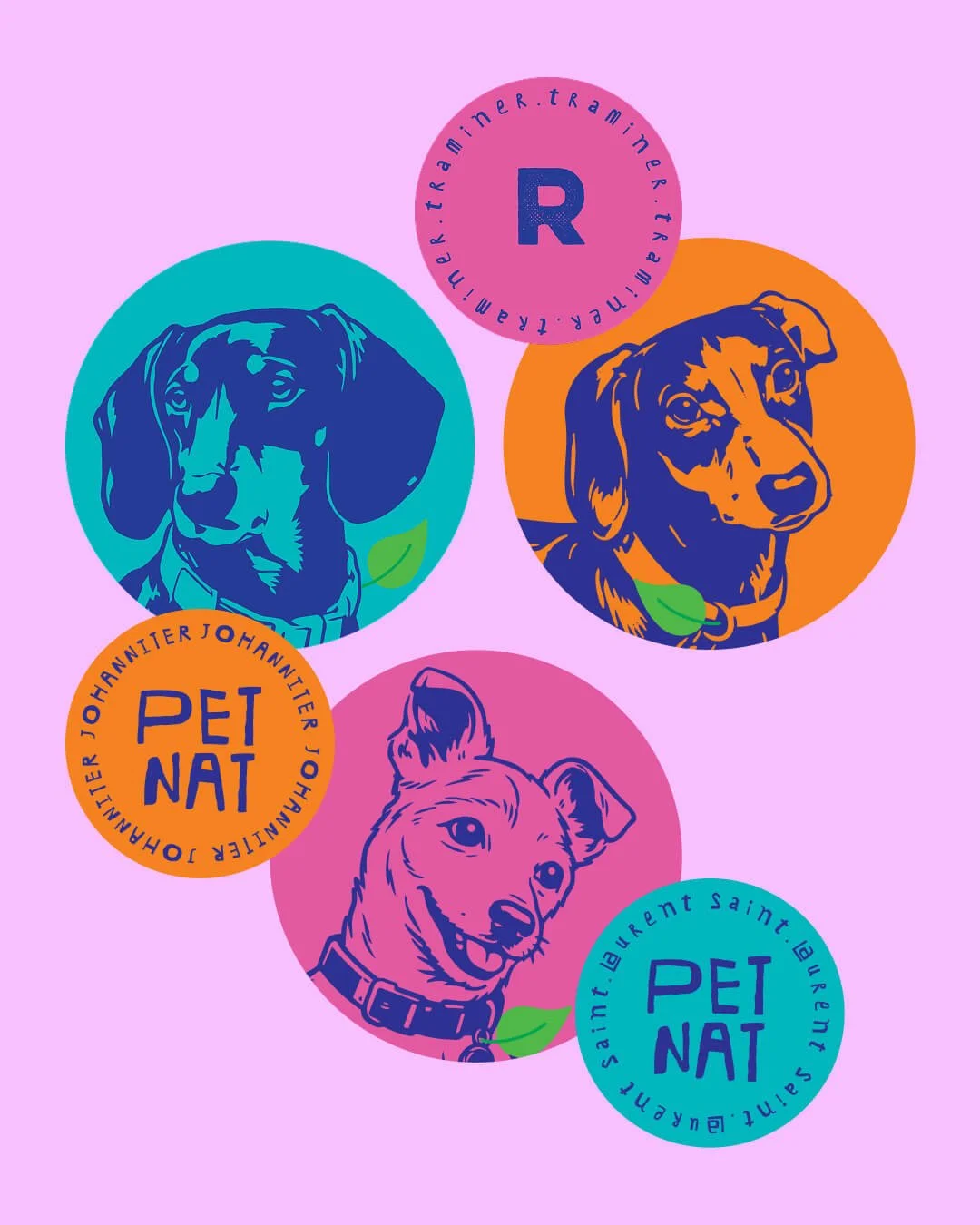
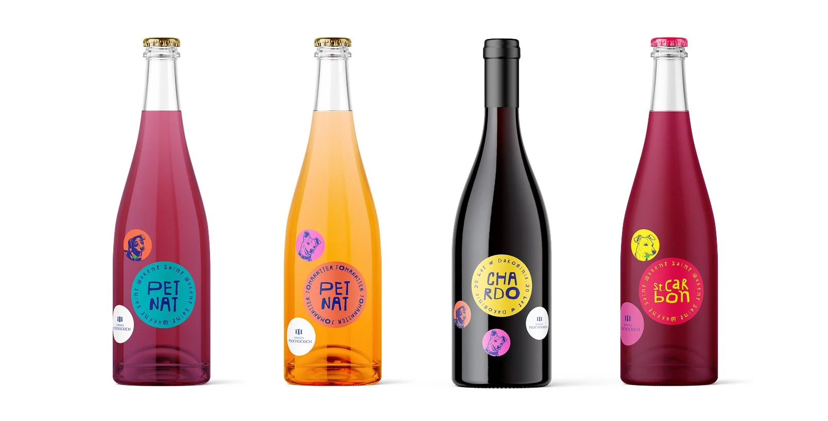
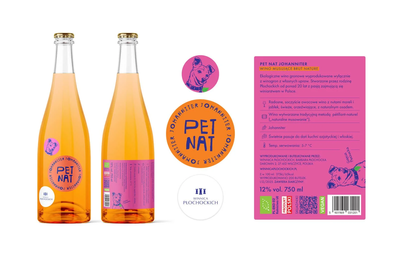
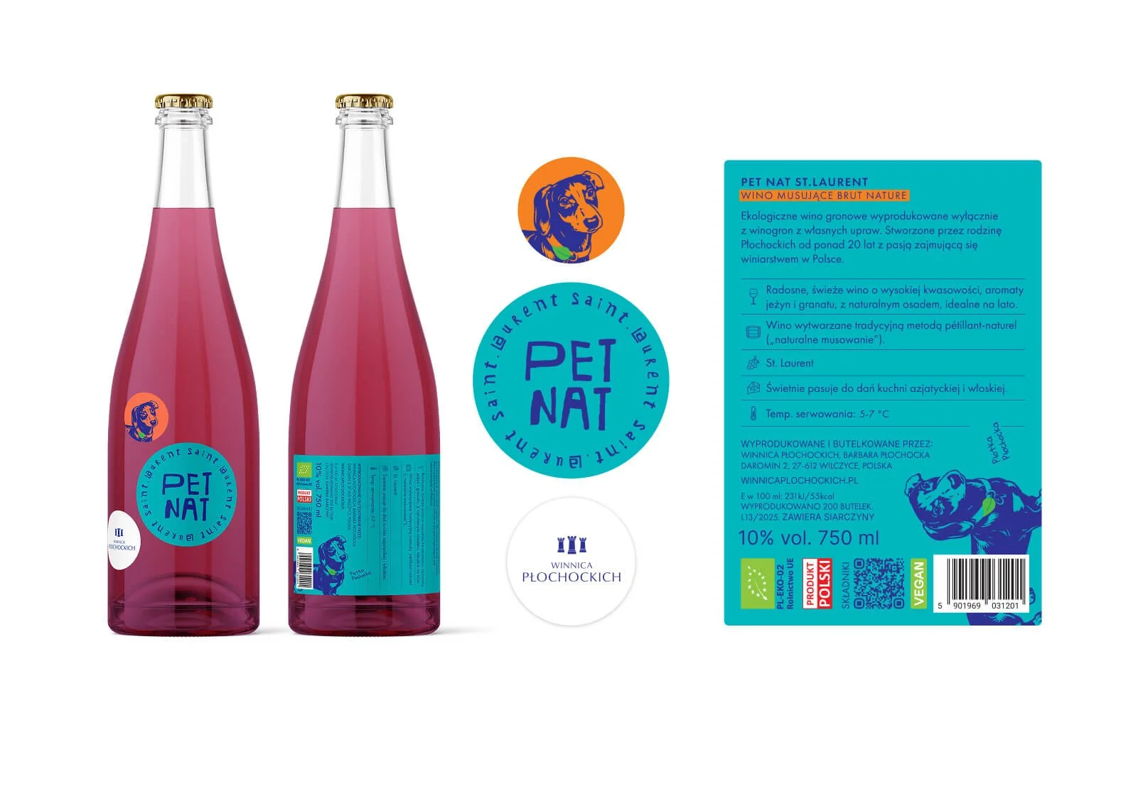
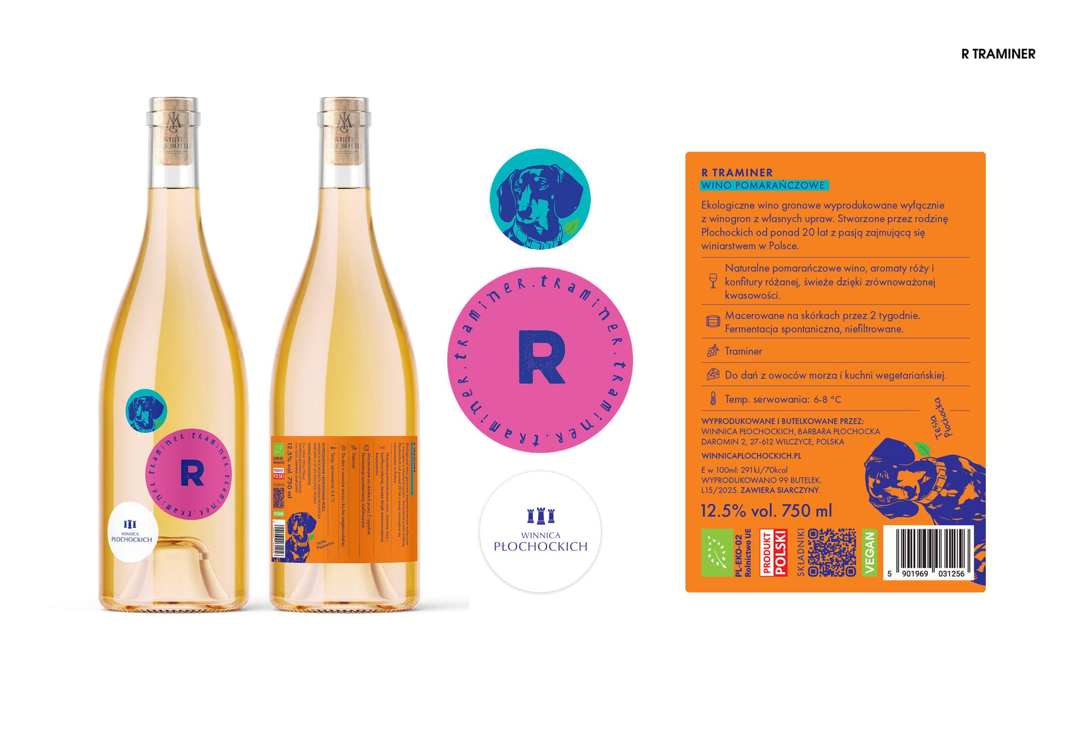
EXPERIMENTAL LINE - colourful stickers with winery’s furry friends.
PREMIUM LINE. A refined, minimal identity built around a colour palette inspired by the vineyard’s natural elements - soil, grapevine, sunlight, stone, clay, water and air. Printed on premium textured paper, the labels combine hot-stamped details and raised spot UV to add depth, tactility and a subtle sense of luxury.